")
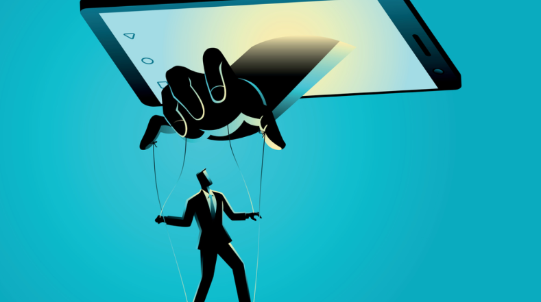
Psychology is the only Scientific subject without a definition. For thousands of years, humans have been studying the complexity of the brain and its behavioral patterns. The mesh of trillion neurons confines within itself an infinite potential of untapped resources. However, when Tech companies resolve to exploit the amenability instead of embracing it, a horrendous and deceiving tactic emerges “Dark Patterns.”
[Image- fpf.org]
What are ‘Dark Patterns in UX’ and why we should be concerned about this? What are its types? Should there be some kind of moral ethics regarding them? In this blog, I will try to discuss every possible aspect surrounding the malicious practice.
Dark Patterns and Its Discovery
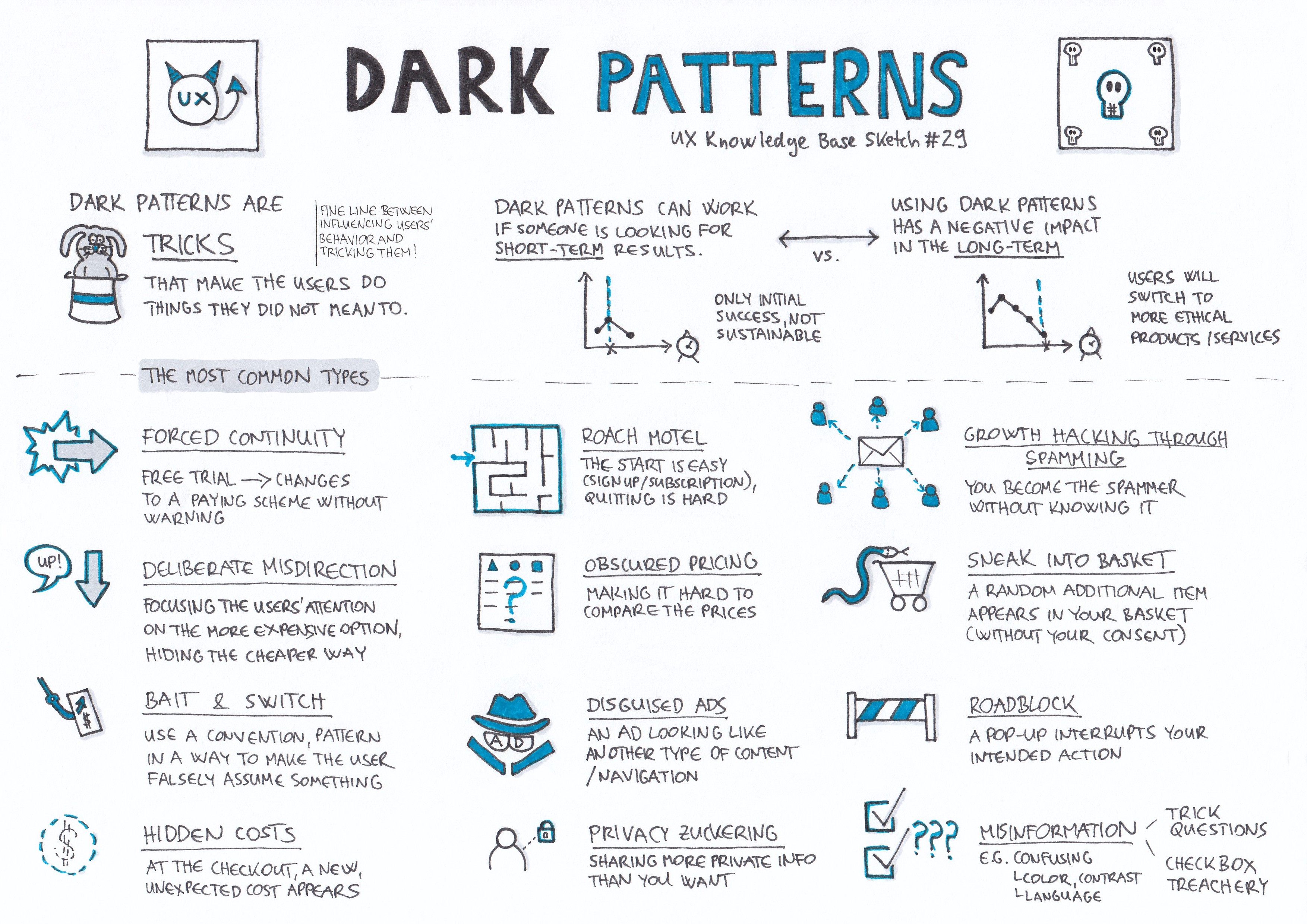
Dark Patterns in UX are very subtle elements of cognitive manipulation designed to trick users into doing something they didn’t intend to. The term was introduced in 2010 by Harry Brignull– London based UX designer after the boom of the E-Commerce industry.
According to him, “When you use the web, you don’t read every word on every page — you skim read and make assumptions. If a company wants to trick you into doing something, they can take advantage of it by making a page look like it is saying one thing when in fact it is saying another.” After getting his Ph.D. in Cognitive Sciences, he came across some websites which deceived the users but benefited the company.
These are never a result of a ‘Bad design’ but they are carefully crafted pieces of human psychology mostly never in favor of users. Therefore, Harry started created a site- Darkpatterns.org to spread awareness and shame those who use such kinds of tricks. He classified every pattern into 11 categories, some of which are noticeable and some invisible to a normal person’s brain function.
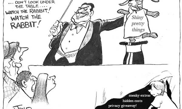
Types of Dark Patterns
Here’s a complete list of Dark patterns some of which you may have encountered but never knew was an unethical application.
- Bait and Switch
This pattern is when a user is looking to take some action to get the desired outcome but instead, end up with a completely unexpected result.
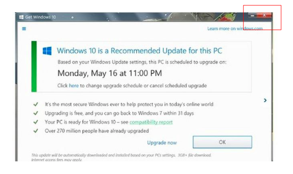
Usually, when a Windows upgrade pops up, users expect the window to be closed when they press the top-right corner ‘X’ icon. However, it results in the upgrade being initialized.
- Confirm Shaming
The trick of shaming a user and making them opt into something. The option to decline is written in such a way that makes users feel guilty.
I came across an example from a site confirmsharing.tumblr.com. You can see in the image how the words of decline option go on to such an extent that they insult the user.
- Disguised Ads
Advertisements that are concealed in such a way as to appear the same as content on the page. This type of design makes the user click on the Ad even though they didn’t want to.
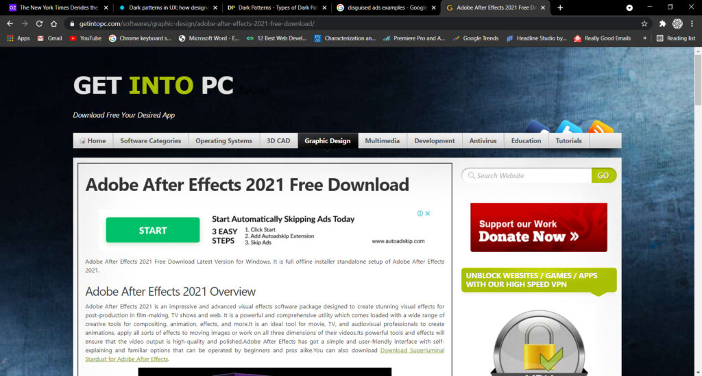
This example is of a site- getintopc.com. Notice that the top banner’s button and background color blends with the web theme to give it the appearance of a download button instead of Ad.
- Forced Continuity
When you opt for a free trial with your credit card and it silently starts charging you without any warning.
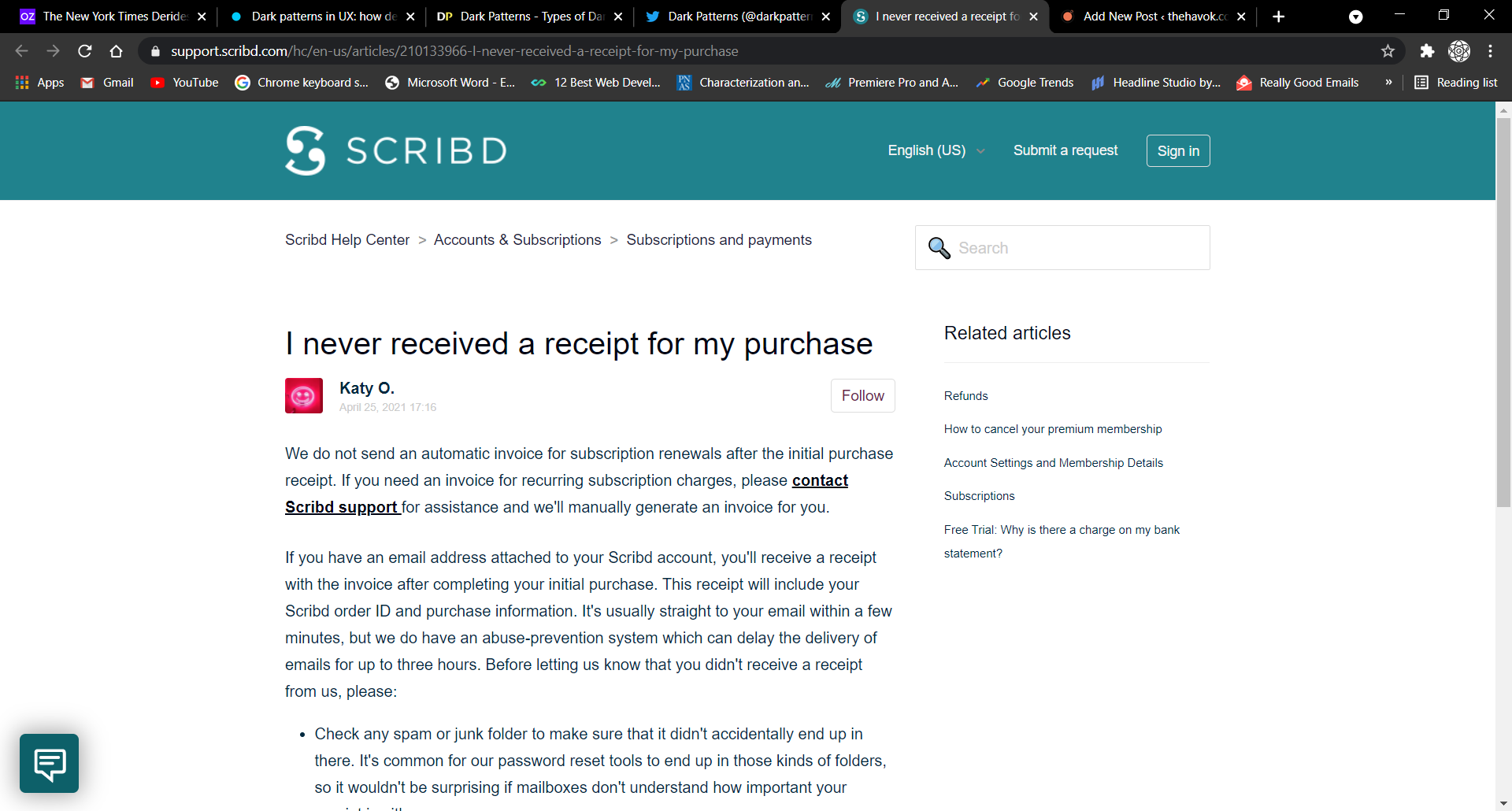
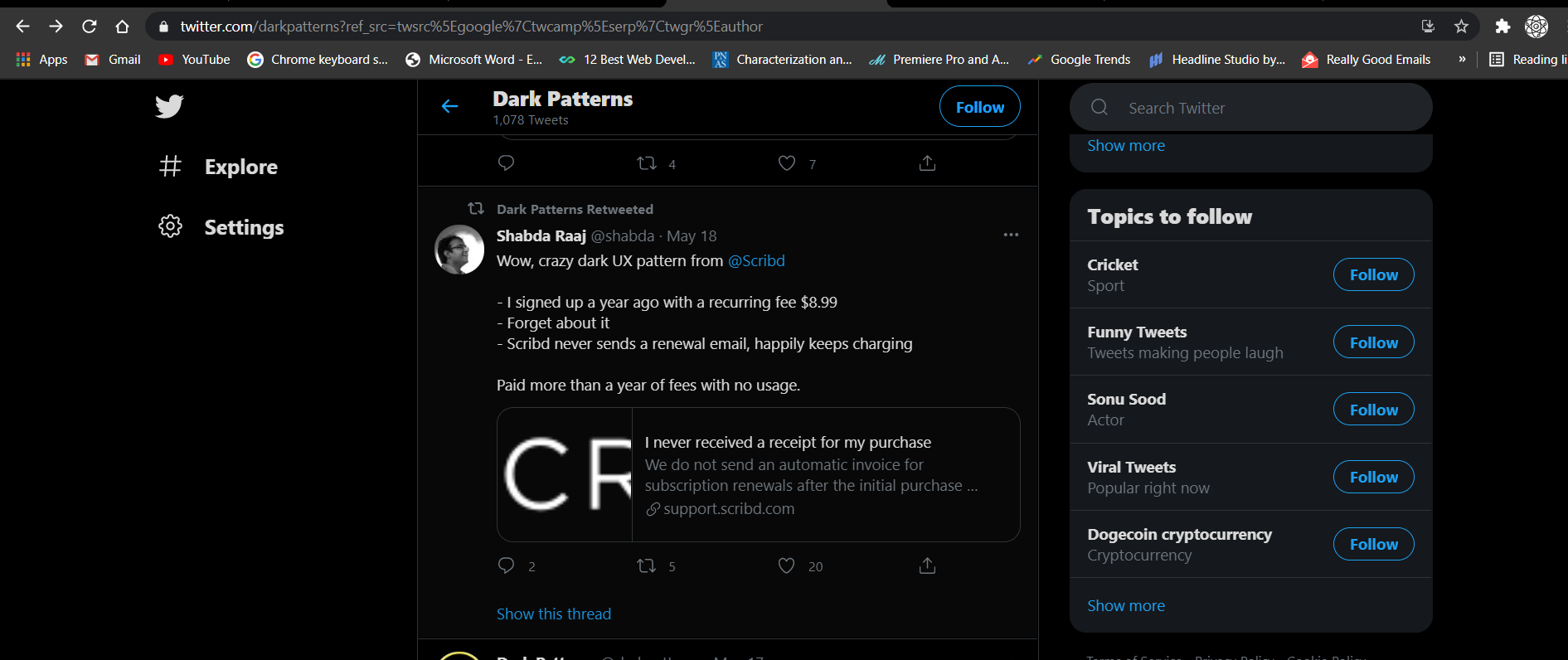
A user named Shabda Raaj mentioned on Twitter about Scribd.com using this dark pattern. The site renewed his account without even sending a renewal email.
- Friend Spam
The web or app service asks for your contact details and contact lists under the pretense it will be used for a desired outcome but later on spams all your contacts claiming it to be a message from you.
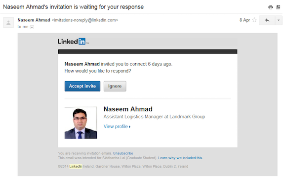
There’s no better example here than LinkedIn. In 2014, a Class Action lawsuit was filed against LinkedIn with the key issue being ‘Spam.’ The problem was with the LinkedIn Add connections feature; it would send emails to all the contacts of a user who were not on LinkedIn and would send 2-3 more if there was no response. The Lawsuit was settled with a penalty of $13 million.
- Hidden Costs
You get to the final step of checkout only to notice some unexpected charges along with your order.
- Misdirection
The design intentionally diverts your attention at one thing to distract you from something else.
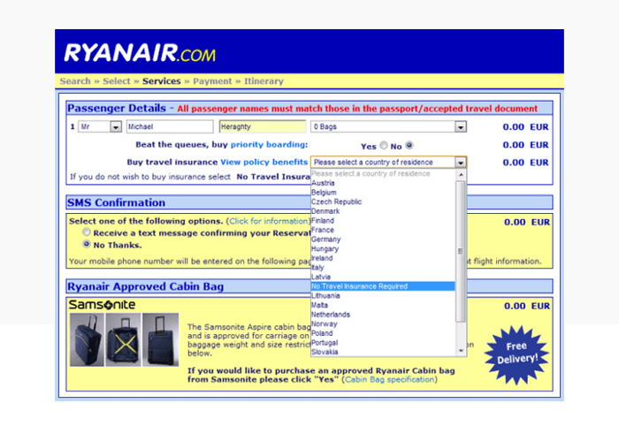
Here’s an example from Ryan Air. On their site, there’s a question whether you want travel insurance or not. Besides, the question is a dropdown menu that asks for your country of residence. The misleading thing is that if you select your country it impulsively adds insurance in the cart too. Now, if you don’t want there’s an option ‘No Insurance Required’ in the dropdown menu itself. This is a Misleading design.
- Price Comparison Prevention
The company or retailer makes it harder for you to compare their pricing with others and delays your decision.
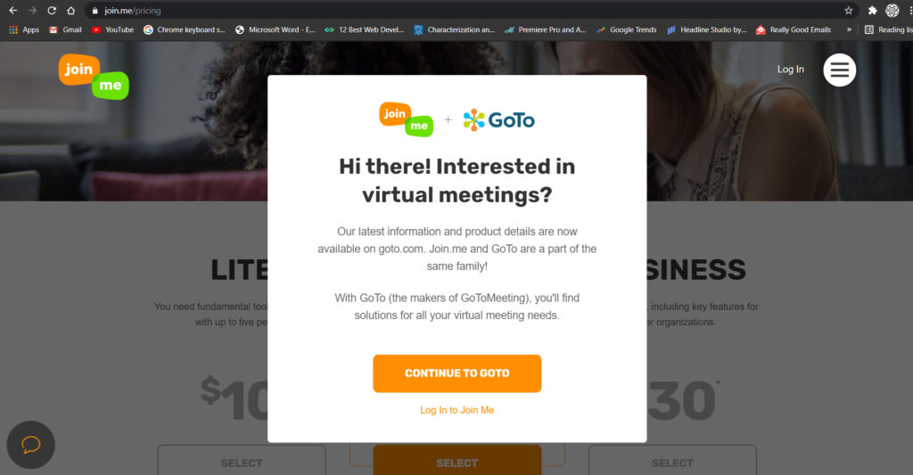
On a site called join.me when you click on the pricing tab, it does not let you see the price instead it redirects you either to the login page or goto.com homepage. You cannot see the price without creating an account.
- Privacy Zuckering
The user is tricked into revealing more details than it intended to. I need not tell you after whom it’s really named! (😮)
- Roach Motel
This one’s my personal favorite as it’s based solely on the psychological process of the brain.
You get into the situation very easily but it’s hard to get out. Inspired from a Motel where people checked in but could never leave! (Sounds almost like a thriller- movie plot! 😬)
The most common example is the Amazon account deletion process.
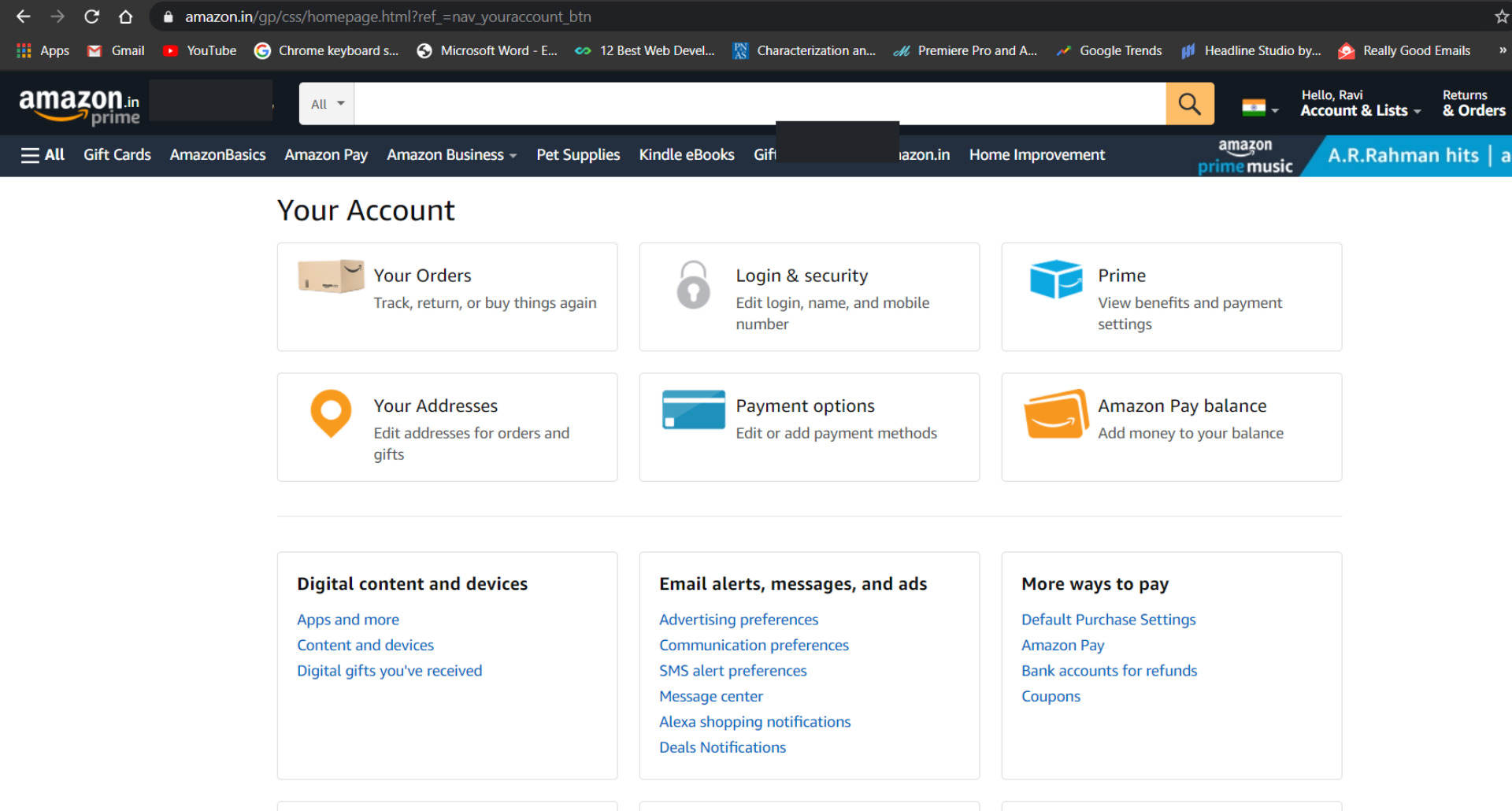
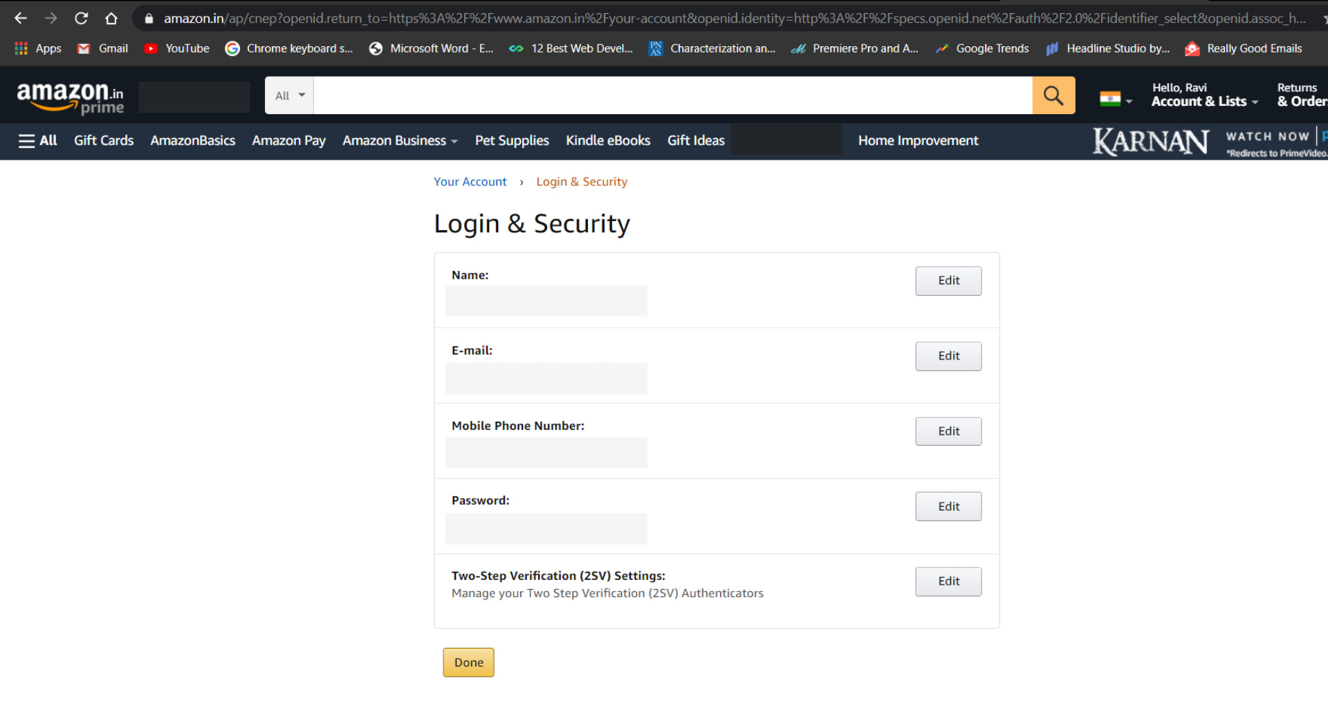
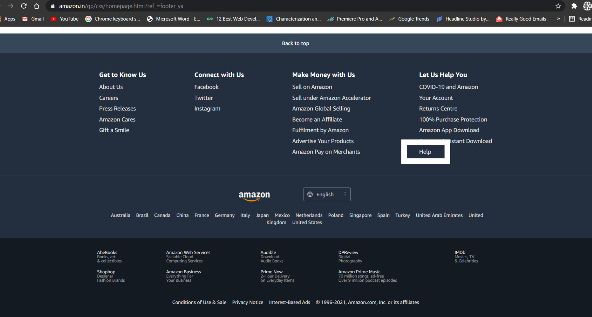
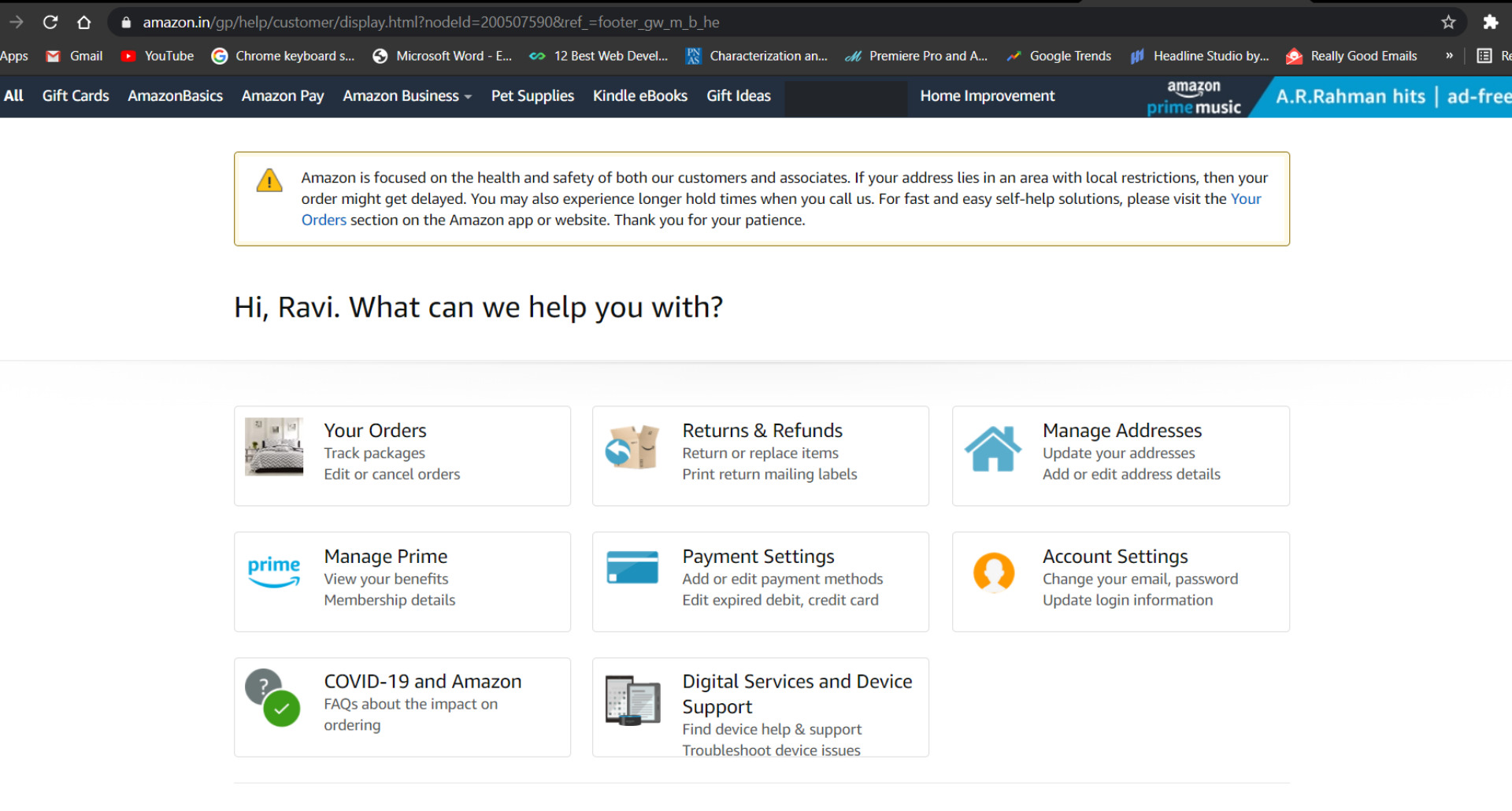
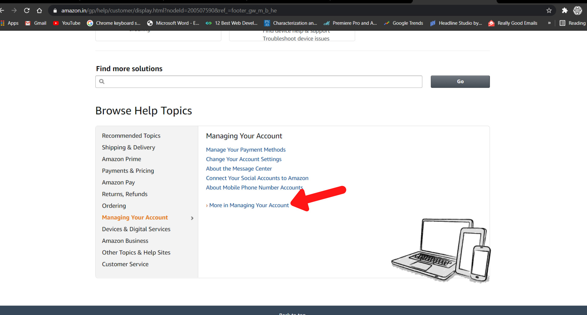
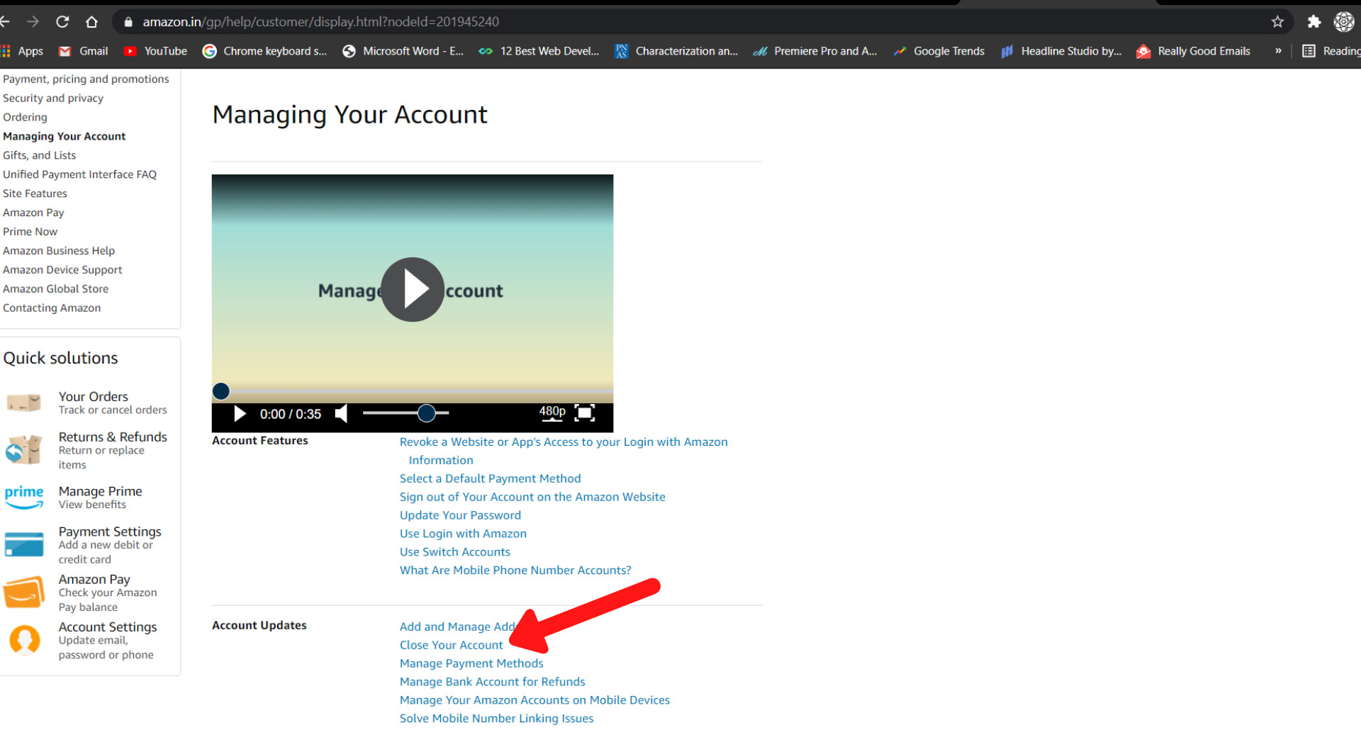
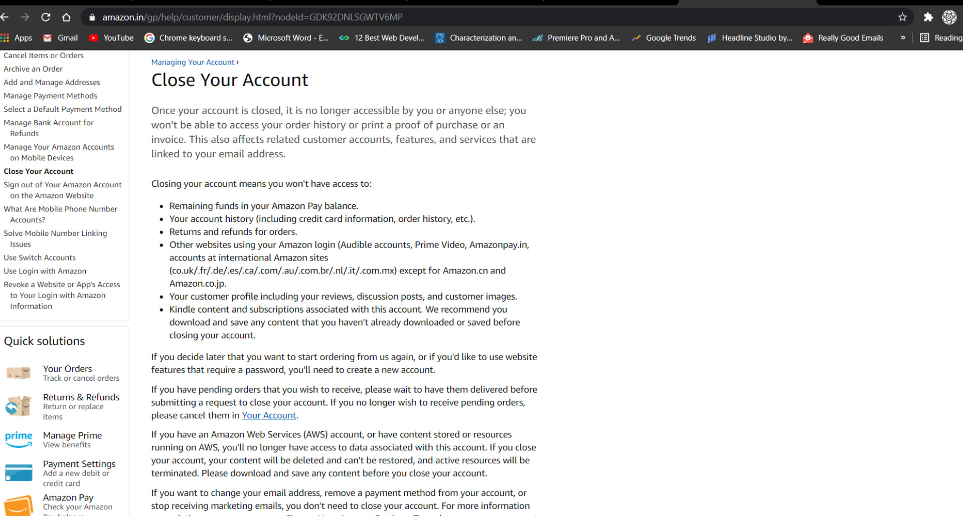
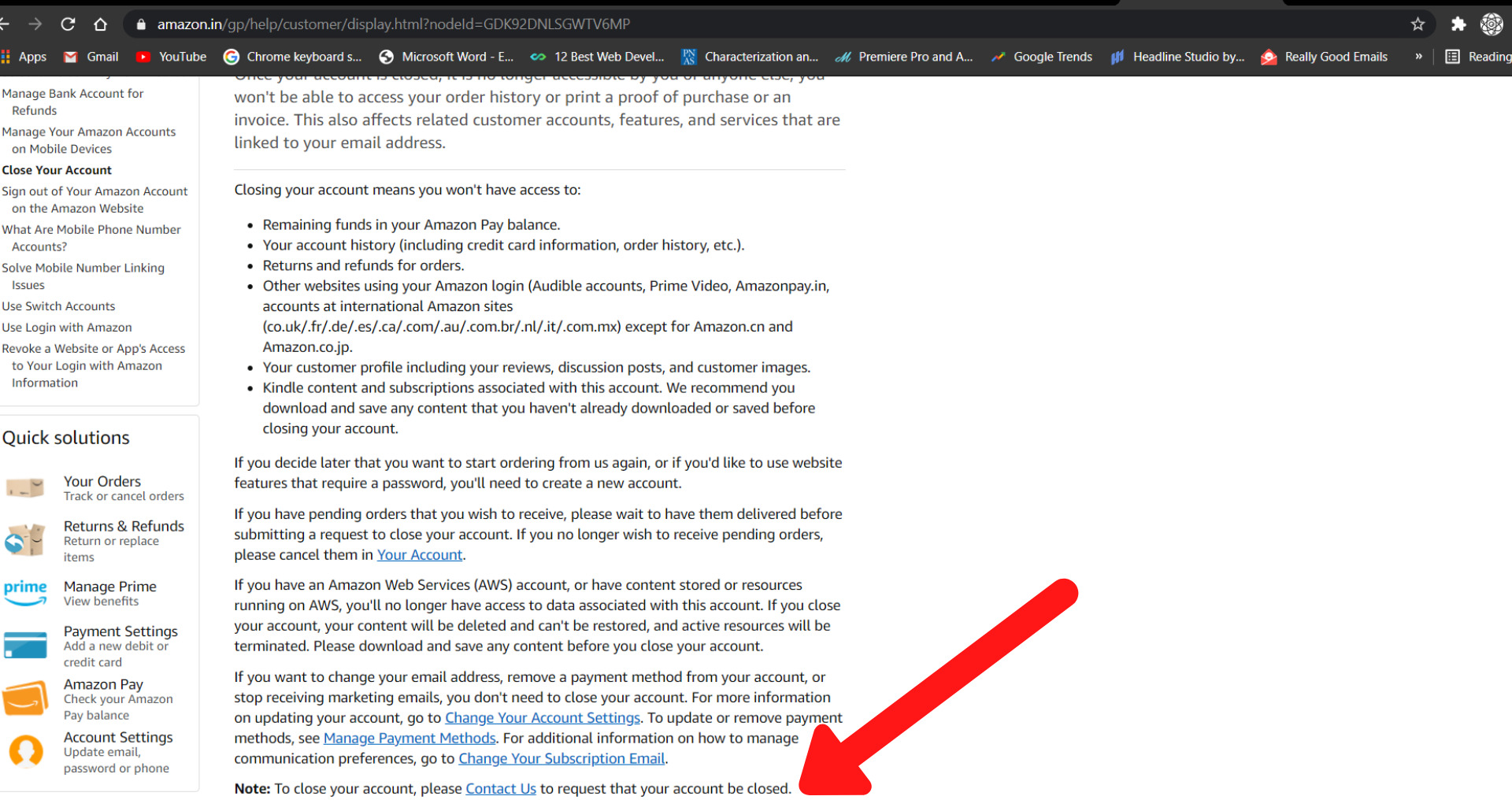
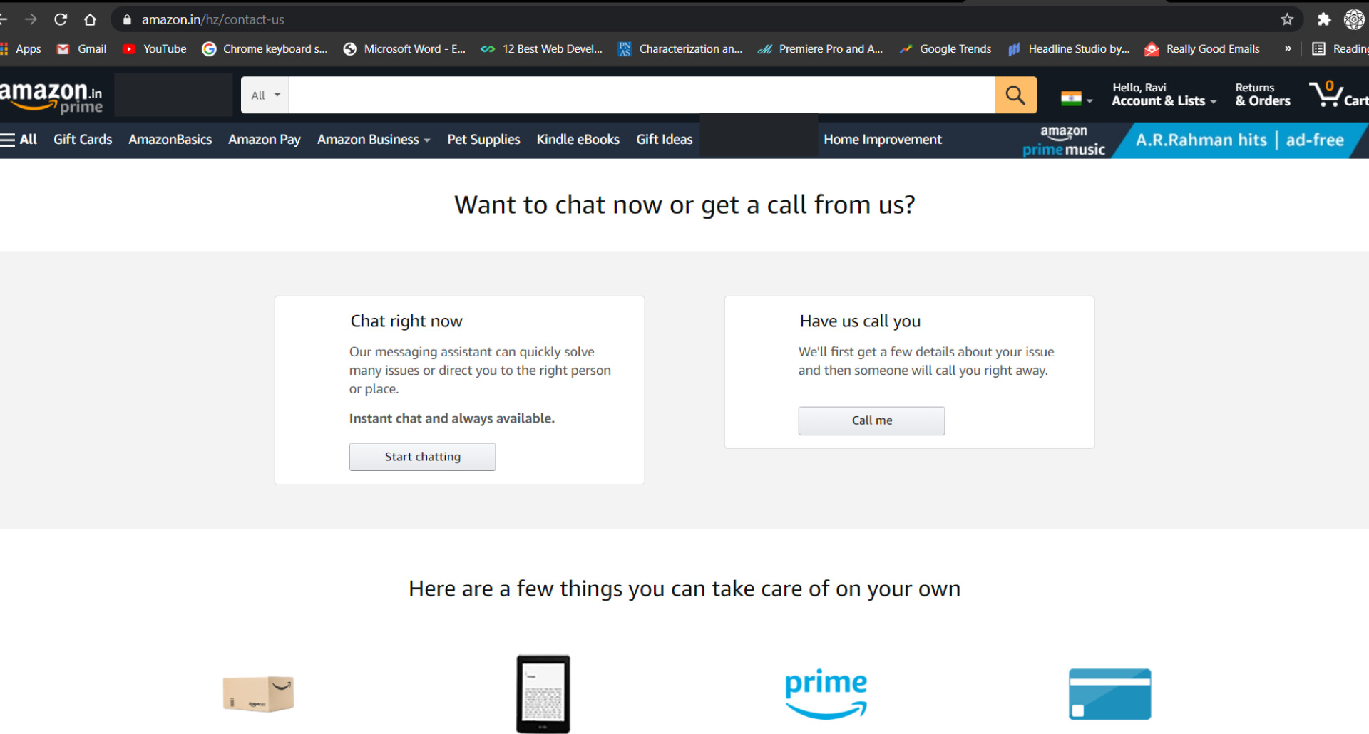
It’s a Labyrinthine process that requires series of multiple screens and clicks and a whole lot of patience. When you try to delete your account you would expect it to find it under My account ➡ Login and security, but a dead-end. In order to get there, you will need to select Help ➡ Managing your Account ➡ Close Account ➡ Chat or Call. The steps are designed in such a way as to tire the user and force him not into taking that action.
- Sneak Into Basket
You attempt to purchase something but somewhere in the buying process, the site sneaks an additional item in the box usually accompanied by a delete or opt-out option.
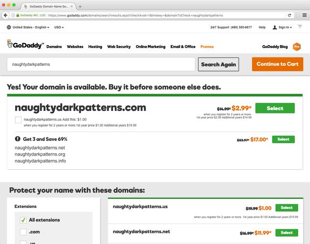
Go daddy is one such example where they include a privacy protection plan with the domain name. (Not Complimentary!!😠)
Will the Times Change?
Every company wants to be loyal and maintain the connection of trust with their users. What they aren’t aware of is that users who face these patterns complain online to other people telling them not to do business with them. The short-term profit-at-all-costs models negate the future reflection of the company. Nil Eyar, former lecturer at Stanford University proposes the “Regret Test.”
He cites his point by saying “When building any tool the designer should ask: If people knew what it would take to cancel, would they still subscribe?” (Amazon Example)
It’s the company that sets the standard for their model to pass. Designers have a lot of power in their hands, they are like the compass that guides the sailor in the vast sea. It’s up to them to decide the ethicality and question the morality of their designs.
What we need to protect ourselves from Dark Pattern are not laws, but to repudiate the Economic Paradigm to regulate public interests even if it doesn’t align with their ‘Financial Incentives.’
“With great powers, come great Responsibilities.”
If you also experience these kinds of design using Dark Patterns, spread awareness about it by a simple tweet @darkpatterns
It’s actually a great and helpful piece of info. I’m satisfied that you just shared this useful information with us.
Please keep us informed like this. Thanks for sharing.
Hi friends, its great post about educationand fully defined, keep it up all the
time.
We absolutely love your blog and find most of your post’s to be just what I’m
looking for. can you offer guest writers to write content
to suit your needs? I wouldn’t mind producing a
post or elaborating on a few of the subjects you write in relation to
here. Again, awesome weblog!
you’re truly a excellent webmaster. The web site loading pace is incredible.
It sort of feels that you’re doing any distinctive trick.
Also, The contents are masterpiece. you have performed a excellent
task on this matter!
Attractive section of content. I just stumbled upon your web site and in accession capital to assert that
I acquire actually enjoyed account your blog posts. Any way I’ll
be subscribing to your augment and even I achievement you access consistently
fast.