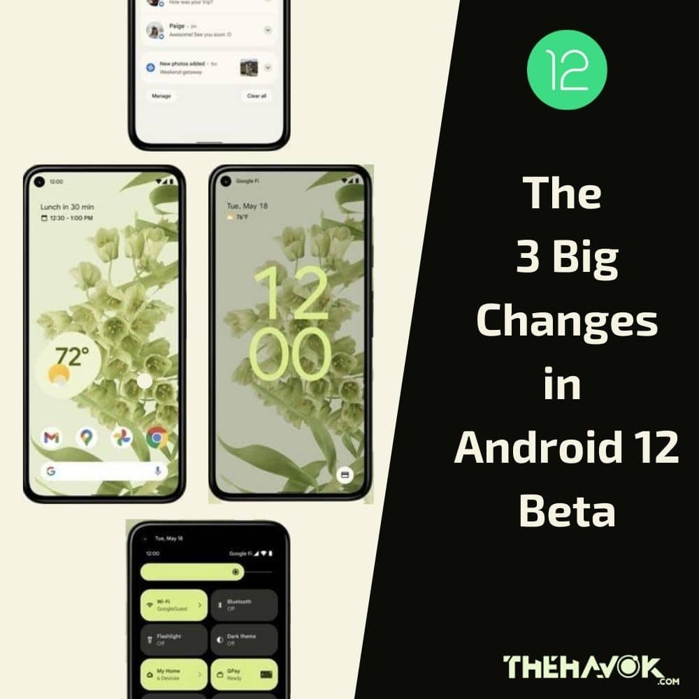
Google has finally announced the first beta programme for its latest Android – Android 12. The dessert name of the Android series has been discontinued since Android 10 but the internal codebase still uses the dessert name and that is “Snow-cone” There has been a complete transformation of the stock android experience in the latest version of Android. Android 12 brings the biggest UI changes after the release of Android Lollipop (Android 5). It has a completely new UI, new animations, dynamic widgets, new privacy features, and many new features.
Material You
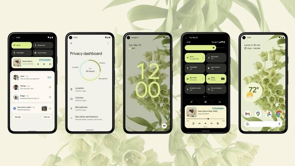
Material You is the next generation of the material design which was followed in the previous builds of the Android. With Material You, Android 12 brings many new animations, new material design, new colors, new widgets and many more to the UI. It uses a color extraction feature, which based on your wallpaper, extracts the prominent and the complementary colors, and applies the color theme to your volume rockers, quick settings, toggles, regular settings, etc.

Android 12’s lock screen has a bigger clock in the center, which looks pretty elegant. The clock shifts slightly to the left when there is a notification and comes back to the center after dismissing the notification. The same pattern goes with the Always On Display. Lock screen notifications are more rounded and change their shape when you swipe the notification. It has new animation when you put your phone on charging, making it more lively than ever.

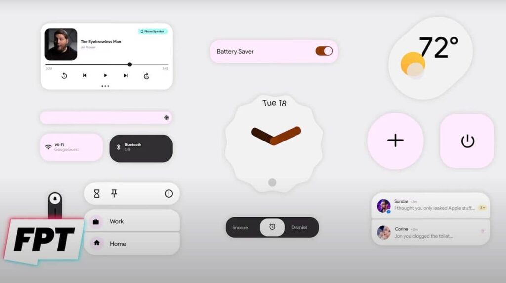
The quick settings menu has also got a big change, which kind of looks like MIUI. Instead of circular toggles, it has rectangular round-cornered cards which are more informative than toggles and covers a large part of the screen. It has new buttons which allow you to access home lights, payment info directly. The shape of the cards matches the shape of the media player in Android-11.
The notification panel has got some minor changes. The corners are more rounded along with an app icon on the left. The snooze button is now more reachable. The notification swipe animation from the lock screen is the same in the notification panel. It has two buttons on the bottom, one for the notification history and the other to manage notifications.
The settings has also got some visual changes. It has new fluid animations on tap and by scrolling. The settings panel looks more like Samsung’s One UI, the upper portion is empty having only a bold sized heading making it more reachable with one hand. The panels have got more spacing between them.
Apart from these, there are some changes to volume rockers, brightness sliders, new animations, a wider color palette, a new splash screen for all apps and many others.
New features
Android 12 has brought a lot of new features other than visual changes. It has a one-handed mode which is exactly similar to iOS’s reachability feature. Once activated, the screen gets adjusted to the lower half of the display making it easily accessible by one hand. With one swipe up, the screen gets back to its normal size.
Google Assistant can now be accessed by long-pressing the power button, but by doing that you’d no longer be able to use the smart home controls and google pay features from the power menu. These features can still be accessed from the Quick settings and their respective apps. Obviously, this feature can be turned on/off from the settings menu.
Volume rocker gets a completely new design with large buttons and a wider scrollbar which is easier to use. The same goes with the brightness slider which is thicker and easier to use.
One of the major changes is done with the dynamic widgets on Android 12 which some would say is copied from iOS 14. The widget drawer is also reorganized to be more useful.

Privacy
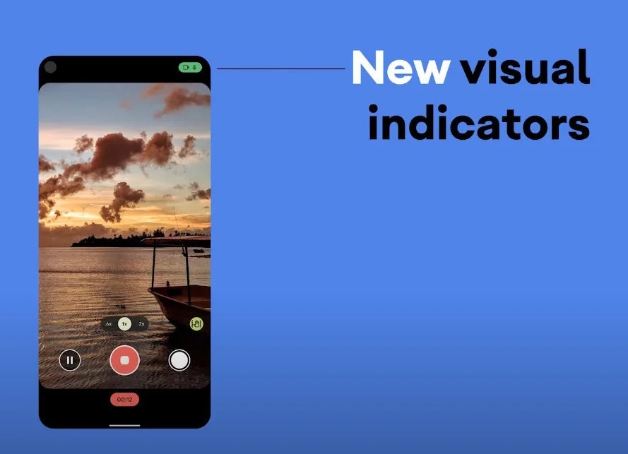
Android 12 brings major changes to privacy again which can be said to have been copied from iOS 14. Android 12 comes with a privacy dashboard that tells us for how long a particular app has been using location, camera or microphone. It has a privacy indicator (much like iOS) which tells whether an app is using the microphone or camera. The location settings now include an option to provide an approximate location rather than the exact location to an app.
Android 12 comes with a private computer core which is like a secondary partition for AI features like live caption, etc.

Thus Android 12 is more secure, more beautiful, more dynamic elements, cool animations and more colors. There are some more features that are to be expected from Android 12 but are not yet in Android 12 Beta 1, like scrolling screenshot, lock folder in photos, game toolbar, smart autorotate and app hibernation.
If we have missed some features of Android 12 Beta 1, you can mention them in the comment section.


Can you tell us more about this? I’d like to find out more details.
WOW!
Your website looks so perfect.
Everything is nice not over rated your blogs content every thing is awesome.
Appreciated man.
Good Wishes From thementalhappiness
https://www.thementalhappiness.com/trypophobia-the-phobia-of-holes/